I went through a lot of revisions to get to the final design for Vestiges, but my indecision is your gain in that I have plenty of artwork for wallpapers and prints going forward. Once I find someone who does quality cardstock prints at an affordable price, I’ll be sending some out to my Patreon supporters. Anywho, check out the art:
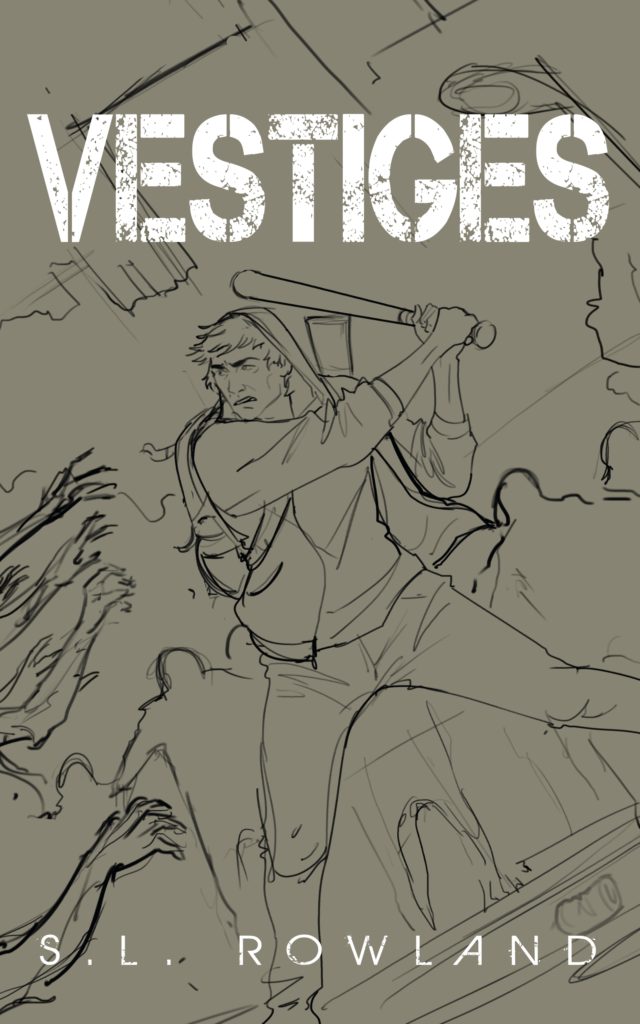
First up is the initial sketch. I loved it from the moment I saw it and new it was the one.
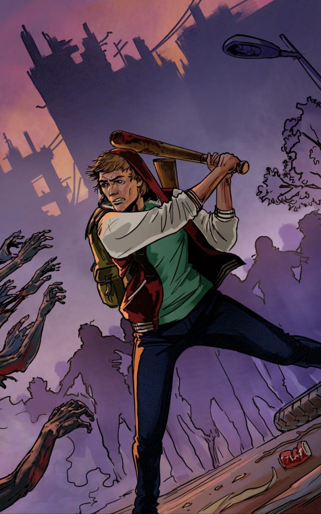
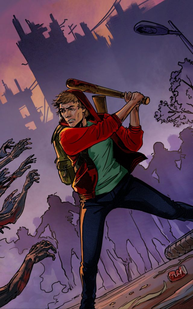
Then came a colorized version. I told my artist that I loved the style of The Walking Dead comic covers and he went in that direction with the line art. He gave me two different variations and I wasn’t really feeling the sporty jacket so we went with the red one.
Then came font choices. I was workshopping these in several groups and a common complaint were that they looked more like comic covers than novel covers. So even though I loved the art, I went back to my cover artist and asked if he could color it in a way that more mimicked my other covers.

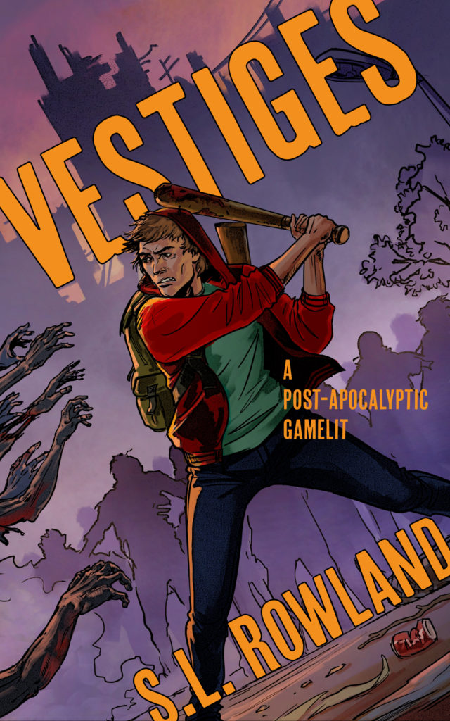

This was the new painting style. I absolutely love the other style, but I think this is more fitting for the genre.
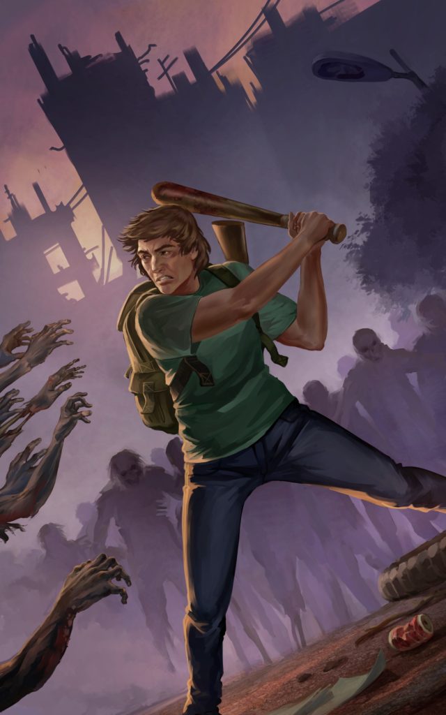
I ended up choosing the light version because I thought it would pop more on the page.


What do you think? Which is your favorite?
