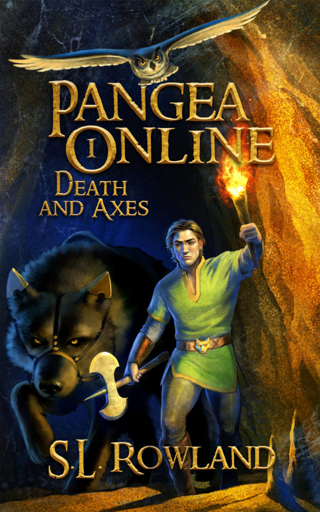
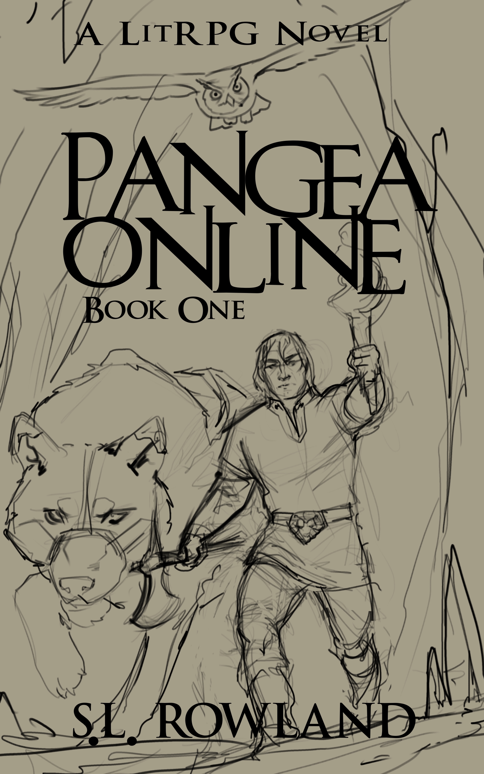
I’ve officially passed the halfway mark of Pangea Online book 2. I’m keeping the name under wraps for now, but I thought it might be fun to show you some of the alternate cover designs we went through for Death and Axes.
Here was the initial sketch after I sent my cover designer a synopsis of the book. This was the first time I had seen a mock-up of my characters and I was completely blown away. I immediately said to proceed.
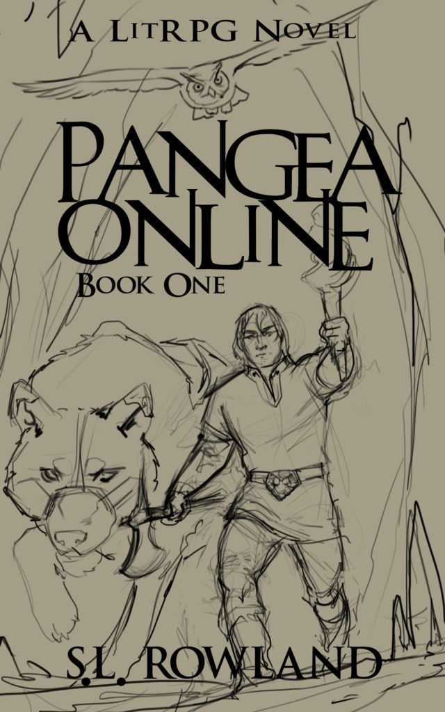
Then came a colorized version. I like it a lot, but several things stood out to me. First, Fenrir, the wolf, is black in the novel. I was worried it might clash with the dark tunnel, but I felt like it had to be corrected. I’m not a firm believer that the cover has to depict a scene from the book, but I do believe the characters should be as they are. Also, I wasn’t a fan of Esil’s face. He looked kind of like a neanderthal, and I wasn’t digging it. I also didn’t like the font. Most fantasy novels have a bit of a metallic or stone feel to them, so I wanted something more akin to that.
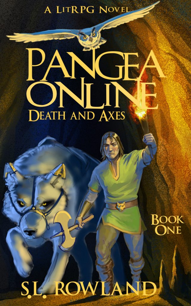
After taking my suggestions, this next version was very close to the final version. The color of the wolf was changed and Esil got a makeover based off of a combination of Jaime Lannister and Robert Pattinson (don’t tell anyone that). The font was getting better, but I thought it was a little too thin and the cover was starting to get wordy.
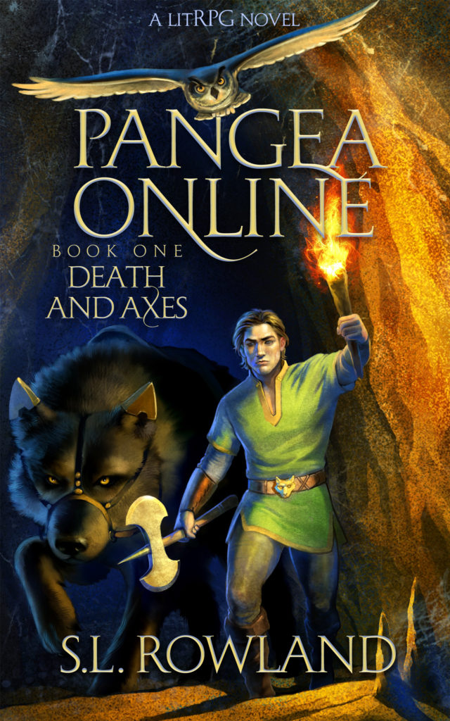
And here is the final version. I liked how the book number was hidden inside of the ‘O’ to free up space but also signify the series number. The thicker letters stand out more and even though they are a similar color to the cave, they remain noticeable.
